Flora & Folio
Overview

Year
2025
Client
Self-Initiated
Project Type
Product Design
The Problem
A frustrating shopping experience can mean wasted time and money
Selecting flower arrangements can be a difficult and frustrating process. Shops tend to have a seemingly unlimited number of options, which is often attractive to many customers because they have a better chance of finding something that matches their preferences. However, convoluted descriptions and poor organization can make it nearly impossible for customers to settle on an option they feel confident in. As a result, customers may feel that their time and money have been wasted
The Solution
Lead with Visuals
Design a flower shop mobile app that is led by visuals for arrangements and a clear design hierarchy so the shopping experience feels clear and not overwhelming.

The Process
Research Approach
In order to better understand the habits, needs, and pain points of customers, I decided the user interviews were an essential first step. The goals of my research included the following:
00-1
Patterns
00-2
Hindrances
00-3
Motivations
00-4
Confidence
User Interview Summary
Sites often use the same exhausted layouts which can lead to poor findability and be visually boring for users.
Oftentimes flower arrangement sites and apps are congested and overwhelming resulting in confusing navigation
Many users are unfamiliar with arrangements and bouquets and have difficulty selecting the perfect item or finding contact information to help them.
Defining the User
Design a flower shop mobile app that is led by visuals for arrangements and a clear design hierarchy so the shopping experience feels clear and not overwhelming.


Ideate
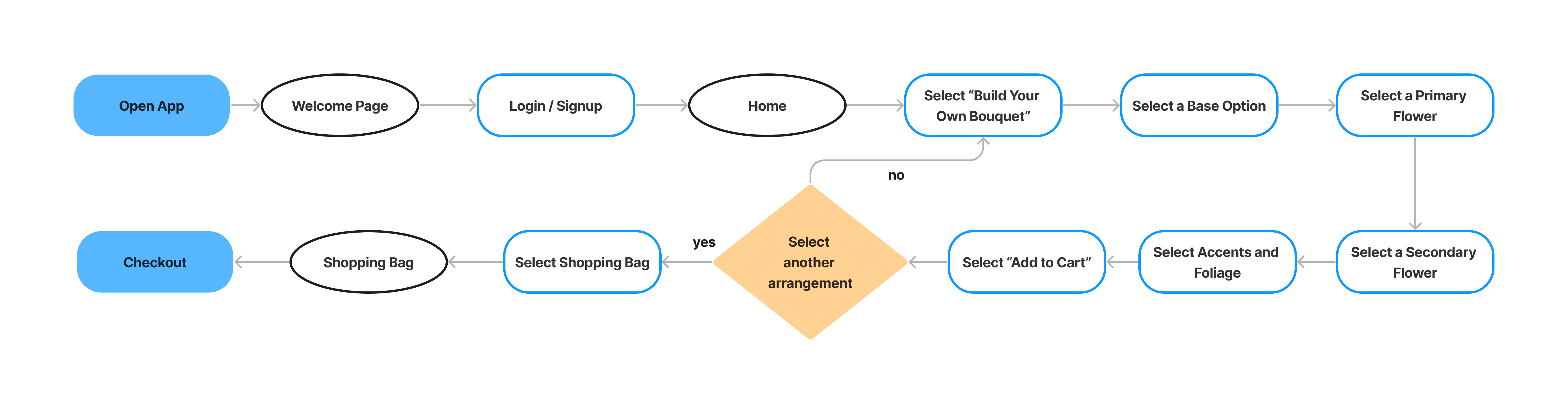
After gaining a better understanding of the users wants and needs, I developed an application map to layout essential pages and features. With defined pages and features, I then developed the main user task flows and sketched wireframes
Map

Task Flow 1

Task Flow 2


WireFrames
Design
Design a flower shop mobile app that is led by visuals for arrangements and a clear design hierarchy so the shopping experience feels clear and not overwhelming.
Lo-Fi Prototype

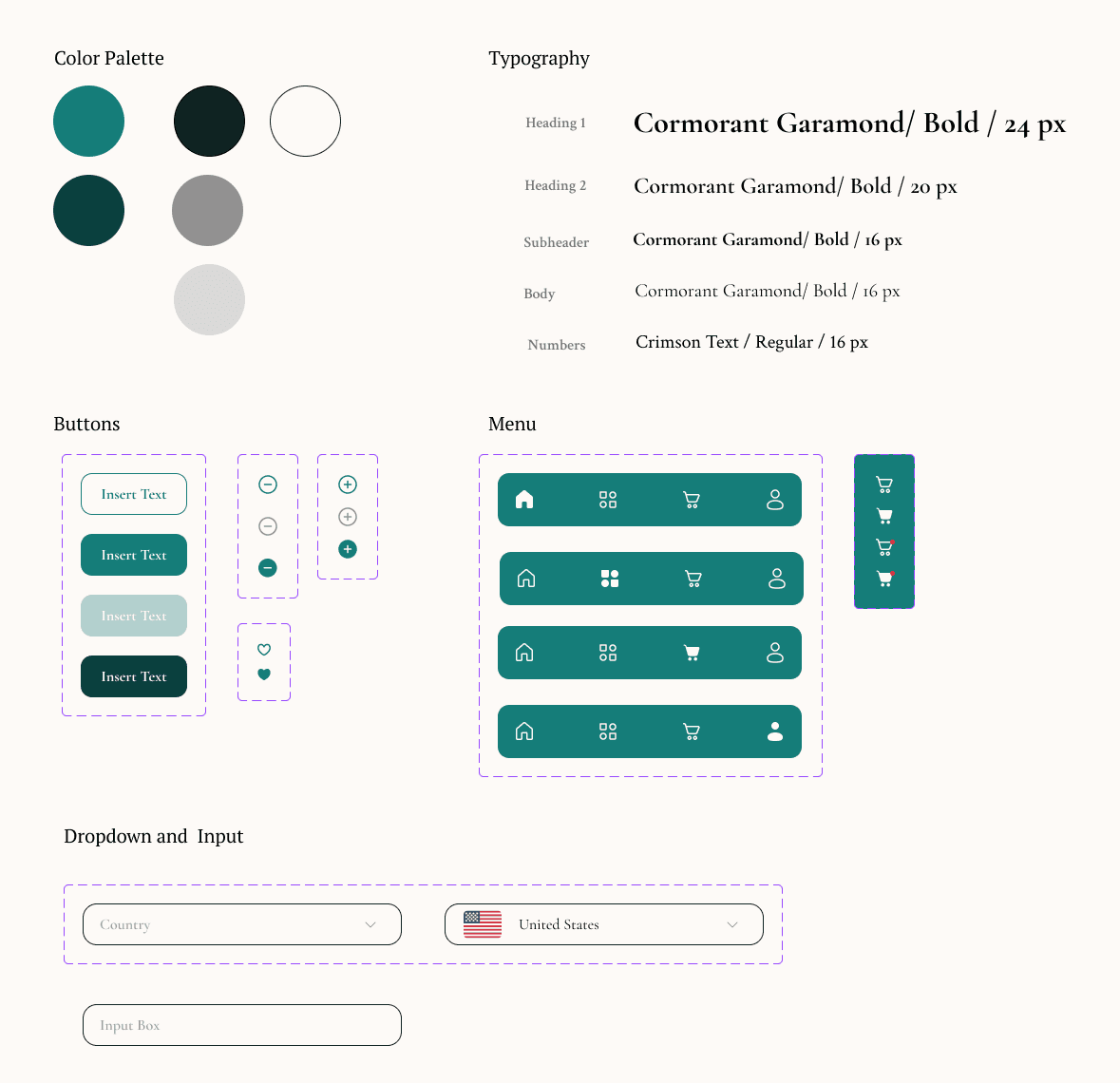
Stlye Guide
During the revision process, I realized the project’s visual style needed a refresh. The original color palette felt overwhelming and didn’t guide the user’s attention effectively.
In the redesign, I applied the 60-30-10 color rule to create better visual balance and updated the typography to establish a clearer, more consistent hierarchy
Test
To test the prototype I conducted a usability study and prioritized the findings based on the feedback I received from the participants.
Usability Study Details
Research Questions
How long does it take a user to find and order an arrangement in the app?
What can we learn from the user flow, or the steps that users take, to order an arrangement?
Are there parts of the user flow where users get stuck?
Are there more features that users would like to see included in the app?
Do users think the app is easy or difficult to use?
Participants
5 participants
Three men, two women between the ages of 20 and 55. One participant is a person with a visual impairment.
Methodology
10 minutes per participant
United States (remote)
Unmoderated Usability Study
Users were asked to perform tasks on a low-fidelity prototype
Usability Findings
Priority 0
Found the home page needs clearer labels and more options to easily view and accesss frequently visited sections.
Priority 1
In general, users need better cues for category and filter options.
Priority 2
Users would benefit from calendar view scheduling and the ability to schedule varying arrangements in one order.
The Outcome
Revisions
Considering the goals and pain points outlined at the beginning of the design process, I believe my original design effectively met many of the needs and requirements.
However, revisiting this project after gaining more experience allowed me to recognize areas where my execution had failed. The main thing I wanted to address in this revision process was to fix inconsistencies and some of my visual design choices.

1
Font
2
Buttons
Takeaways
Reflection
Reflecting on this project, I can see how much my design approach has evolved since completing the original Google UX certificate work. At the time, I often got stuck on small visual details too early, which slowed my progress and kept me from focusing on the bigger picture. Since then, I’ve learned to approach design decisions more strategically—keeping the user journey front and center, validating assumptions through testing, and using UX principles like visual hierarchy, accessibility, and task efficiency to guide iterations.
This shift in mindset motivated many of the improvements I made, such as restructuring navigation for faster wayfinding, clarifying button priorities to guide users toward key actions, and rethinking page layouts to reduce friction. Each change was driven by a stronger understanding of how design choices directly impact usability and overall experience.
Looking ahead, I’m committed to continuously refining my process—whether it’s through deeper user research, experimenting with new interaction patterns, or seeking feedback from peers and mentors. My goal is to keep growing as a designer who can balance creativity, usability, and technical execution to create products that truly meet users’ needs